In the early days of my tattoo career, I indiscriminately tattooed client requests without considering aesthetics. I allowed my clients to guide the entire design process. They told me what to include, where, and how big. A few of those tattoos looked amazing, while others, well, let’s just say that they didn’t make my portfolio. Even back then, it was pretty obvious what worked well and what didn’t. When I talk about aesthetics, I’m not talking about what tattoo style looks best, I’m talking about ending up with a visually pleasing tattoo regardless of the style or subject matter.
So aside from technique during tattoo application, what contributes to a tattoo looking good or bad? And isn’t beauty in the eye of the beholder? Sure, aesthetics are a personal preference. However, there are qualities to every tattoo that you should consider regardless of your personal style in order to get the best outcome.
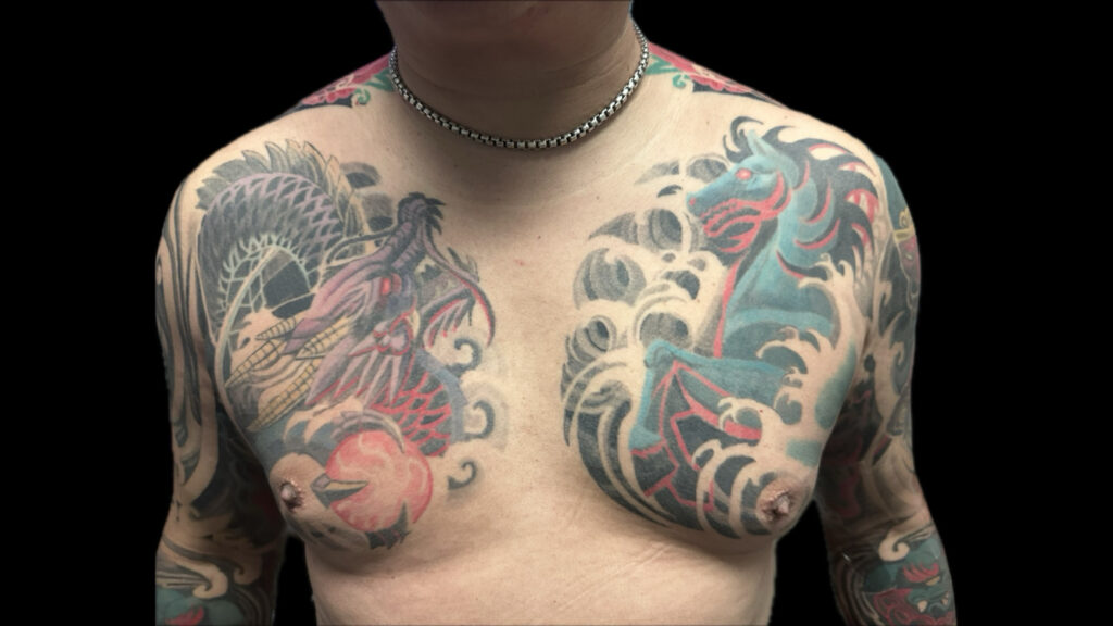
When I evaluate a tattoo design, I look objectively at the “readability” and “fit and flow” of a tattoo. These two factors focus on how a tattoo reads on a person as whole. In reality you see the whole person before you examine the tattoo work. If the overall shape language looks awkward or the tattoo is too small, it may be mistaken for a blemish.
Tattoo Readability

Can you decipher what it is you are looking at? It may sound obvious, but the focal point or subject of your tattoo should be immediately visible. I have seen and done a number of tattoos where a busy composition causes the tattoo to look like a jumble. In other cases, poor contrast might cause the subject to blend right into the background. When evaluating a design, it should be fairly obvious what you are looking at. If it’s an animal tattoo, people should be able to name what animal it is.

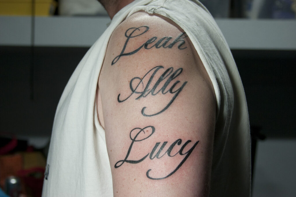
If it’s a text tattoo, it should be large enough to be legible without magnification. One of my clients said that her parents thought she had ants crawling her because her text tattoos were so tiny. While the idea of keeping a tiny reminder or secret on your body might be cool, they might not be very legible from a distance to others. Additionally, as your skin and tattoo ages, chances are the letters won’t remain legible.

The exception to readability would be ornamental tattoo designs which may use abstraction and design elements to decorate the body instead of illustrating a subject matter. In the case of ornamental designs, there should be a good fit and flow to them.
Tattoo Fit and Flow

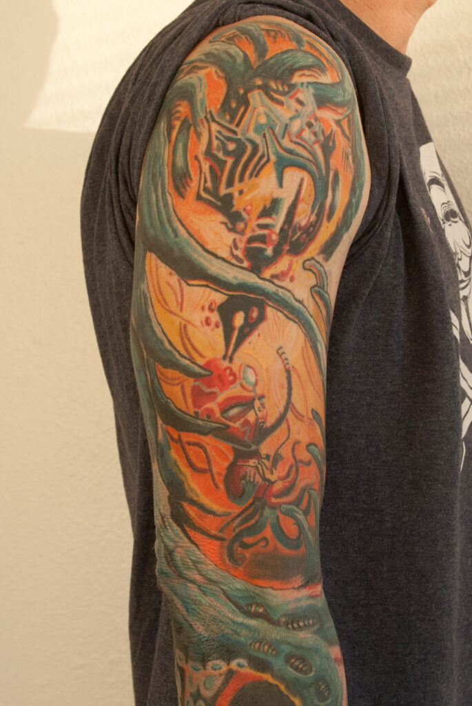
Does the tattoo compliment and fill the space well on a collector’s body? The human body is made up of curves and contours, so designs that feature curvature will appear more harmonious. Curves in a tattoo will also add a feeling of movement and flow to the tattoo. This will allow the viewer’s eyes to move comfortably through the design.
The “fit” of a tattoo pertains to the shape language presented by the design. Many design elements can be beautiful independently, however when combined they may form a blob. Take care to make sure the overall shape of the tattoo compliments the space it’s placed in. For example, if a tattoo is portrait oriented design, then the design would complement a space where the height is longer than the width.

Beauty over Meaning
A lot of clients force imagery into their tattoo because they want it to be meaningful, even though it ends up with bad aesthetics because of odd shape language. I understand that a tattoo may be something personal, but at some point somebody else is going to see it. When they do you want them to say “how beautiful!” instead of “how interesting?” or “tell me what your tattoo means.” Tattooing is a visual artform and a chance to enhance your personal appearance in a positive way. Of course, you are free to express yourself through tattooing as you see fit, but from where I am standing, I want you to look good doing it.
Separate Your Themes Into Different Tattoos Where Possible
As tempting as it is to try and tell your entire life story in one tattoo, it’s better to separate them into different tattoos. When hanging art around a house, you wouldn’t put all the paintings in one room would you? I guess you might, but in order to avoid a cluttered composition in your tattoo, try and spread the ideas out.
Not An End All Way of Evaluating Every Tattoo
This advice is meant to be a starting point for evaluating a tattoo idea. If you ignore the advice, will your tattoo turn out terrible? Maybe. But if you follow this advice, at least you will have a standard to build a better tattoo around. Ultimately, a tattoo is about personal expression, so the person who’s opinion matters most is you. But why not try and have it come out beautiful because you will have to wear it for the rest of your life. Find more tips on getting your first tattoo here.

Leave a Reply
You must be logged in to post a comment.